Flex Direct-to-vehicle App
Evolving a proof-of-concept into a commercial product
Flex (a part of Kaluza) is a startup within a startup, responsible for pitching, researching and delivering innovation in maximising energy use and spend in the electric vehicle sector.
Following my work establishing a design practice from scratch within the OVO International venture, I was asked to lead up a small design team (comprised of myself, a Senior Researcher a Content Writer and another Designer) to aid Flex’s multiple projects. One of such projects was particularly successful and translated into a full app, currently in trial in multiple countries – the Direct-to-vehicle app.
This project started with a rough proof-of-concept built by the engineering team, aiming to circumvent the complexities of connecting with the multitude of brand and models of wall chargers, by reaching directly to the vehicle APIs (hence the term direct-to-vehicle, or D2V). This connection is essential for Kaluza’s algorithms to calculate the best, cheapest and most energy efficient times to charge vehicles automatically. This PoC gained significant traction with clients, and my design team was task with turning it into a commercial product.
Establishing a design process and a focus on user needs
As the Lead Designer on this team, my main initial goal was to shift the aim of this application from a business-oriented solution, into a product that users value because it answers their actual needs.
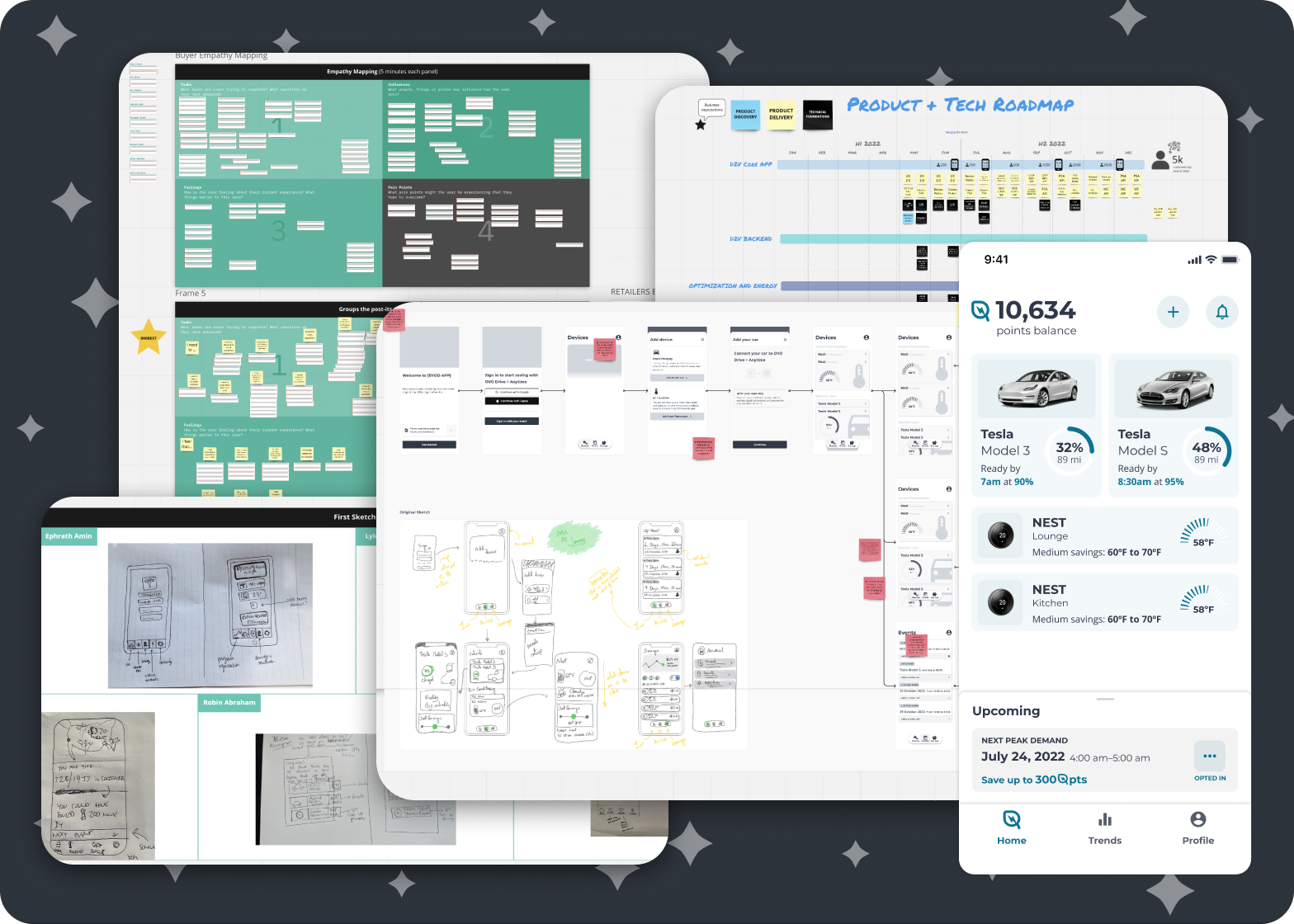
To this end we conducted several research methodologies, from simple competitive analysis and secondary research (to establish the baseline expectations of the market), to extensive usability testing of the current application and exploratory interviews with users of the PoC.
We established there was a clear appetite for automatic charging schedules for vehicles, that would save the user’s money, and require as little upkeep from the user as possible. This was something users already tried to do with their wall-charger, however since these are not directly linked to the electricity provider, they were not able to make smart algorithmic decisions. Because Flex works directly with said providers they are able to tap into the deeper data within the grid and even create specialised tariffs – thus creating a unique value proposition.
This research work was ongoing, and done in a lean format, as I also worked to implement and evolve the PoC iteratively, helping it be delivered successfully during trials in Japan, Australia, US, Italy and more. Each of these versions had different content localisations, which I interfaced and coordinated. From each trial I worked with our Researcher to establish hypothesis and learnings, and applied those to the next iteration.
Thinking ahead
Every iteration of the PoC gave it more and more maturity, but also had to be feasible and contained, so as to meet the deadlines of each trial, which represented a different partnership with a new electricity provider with specific asks. We worked with a relatively small engineering team, and keept a strong focus on prioritisation of features to keep them in line with research findings. However with every trial we gained more learnings and they started to bring into view the need to establish a greater vision and a north-star for the team.
The main aspects we wanted to improve for this north-star, all backed by analytics, research, as well as business objectives from different clients were:
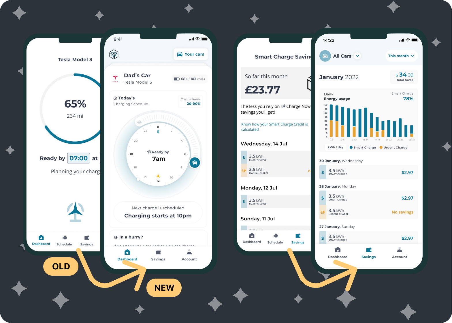
- Allow users to tweak their “Ready by” times more easily and placing that as the focus of the app
- Provide a more guided walk through the value of the product through onboarding
- Support customised weekly schedules
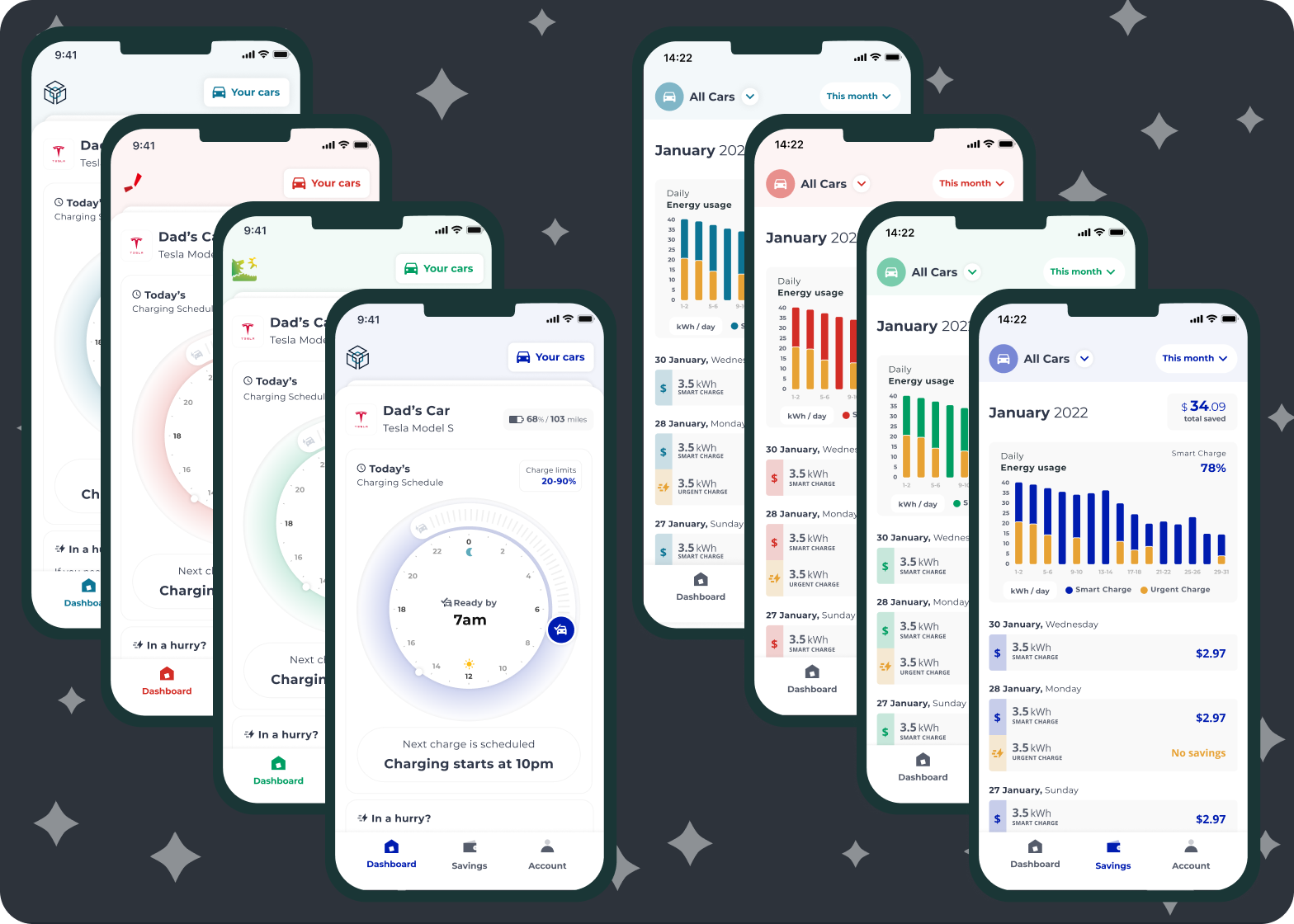
- Improve the overall aesthetic of the app, with a new design system that has white-labelling in mind (and can be spun up to a new client with less effort, using themes)
- More in depth insights for usage, supporting not only charge history but also cost savings.
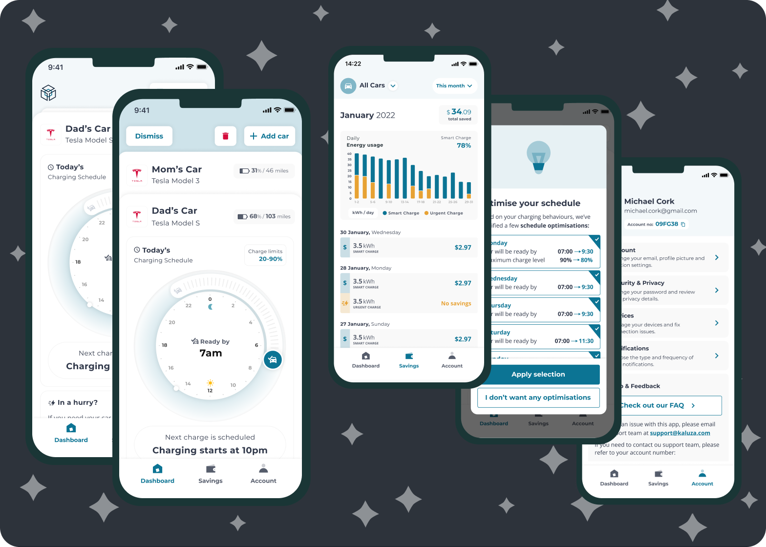
- Rework the information architecture from the ground-up with support for multiple vehicles in mind.
- Refine the content throughout the app for improved understanding and consistency.
Building up the vision
Armed with these main new features, as well as dozens of smaller usability improvements, we organised workshops with all stakeholders and developers to start imagining what the future of the platform could be, as well as prioritise the problems we wanted to tackle.
After multiple sketches, wireframe iterations (which we also concept tested with relevant samples) and high fidelity iterations, we formed up a design concept. I was responsible for all design efforts throughout this process as well. Our Research used a complete prototype of this product to conduct in-situ interviews in California, with great success. The concept was also used to further seek out commercial opportunities with other clients, winning some ambitious pitches. On the right I exemplify how theming the app for different brands can be achieved.
In conjunction with the Product Manager and engineers, we outlined a development roadmap that would progressively convert the PoC into the final concept, with each iteration being prioritised with the user’s more urgent needs in mind. This process of iterative building and learning with each release was one of my main focuses when educating the team on how to work with design efficiently.
The application is still evolving and being used on a number of trials throughout the world and live on the App Store in some countries. It will be turned into a standalone commercial product very soon.
Details
- Designed in 2022
- Duration: 6 months project
- Platforms: iOS & Android
- Tools: Figma, Miro