FanDuel – Lobby experience
Soon after joining FanDuel, I was tasked with leading design efforts for a full end-to-end team (a stream), to work on the daily fantasy product. Our main goal was to increase engagement and interest in the recently launched Discover portion of the app, which is the home screen users are greeted with upon launching the application.
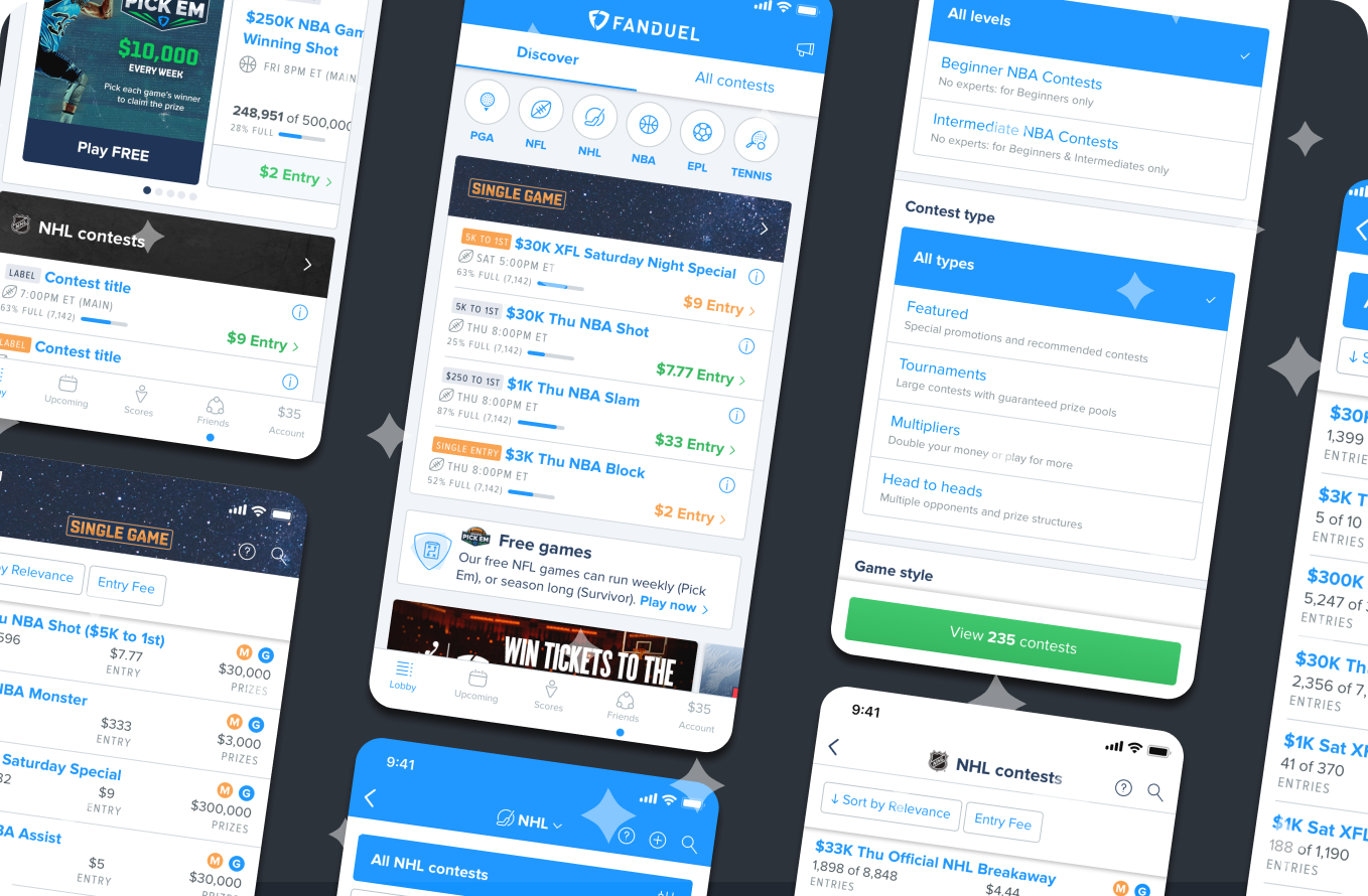
The main goal of Discover was to give beginners a more welcoming and easy to use interface for finding contests, as well as providing experienced players with a more personalised entry point to their favourite content. Our brief for this project was to enrich and further develop this MVP, to help it reach its full potential. We also delivered a new feature that let users find the exact contests they wanted through a set of rich filters.
Based on user research findings and analytics, we found that despite strong usage and conversion with the first few displayed contests (see Before & After video for reference towards previous design), users thought that the experience was monotonous and uninteresting, prompting them to not scroll either vertically down the feed or horizontally within each carousel. Users also wanted faster access to Search, Contest creation and other features.
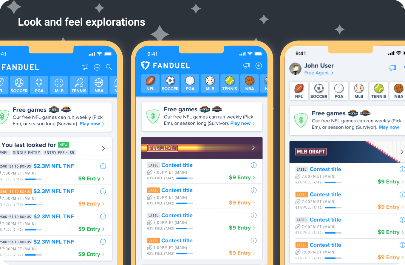
Apart from adding a plethora of usability improvements, our main goal became to increase variety and visual interest throughout the feed – and with that increase variety and interest. During the course of the project I collected feedback and requests from our internal product and marketing teams, and went through multiple iterations of several concepts, all of which were tested with real users (using interactive prototypes).
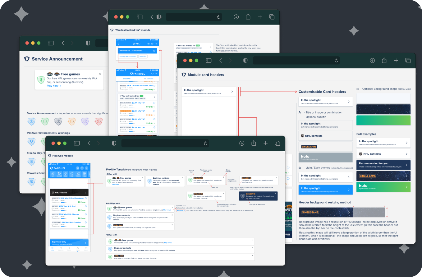
As a final result, I developed a collection of brand new modules that allow full customisation of the feed, allowing our teams to surface content to our users in an engaging way – leveraging the strong imagery and tone of voice from the brand. To guide development and usage of these customisation options I created rich documentation and conducted tutorial meetings with people across the business.
Most of these initial features are now live, but some other important features remain in development or pipeline. While feedback from users has been extremely encouraging so far, we aim to properly study the impact of these changes once most features have been implemented.
Details
- Designed in 2019
- Duration: 6 months project (8 months end-to-end)
- Platforms: Responsive Web and Native iOS & Android)
- Tools: Sketch, Principle


