OVO International: Acquisition and Portal
When I joined Kaluza (which was part of the OVO Group) I was assigned to lead design efforts for the International ventures of OVO Energy, in particular OVO France and OVO Spain.
As the sole and first designer in both teams, I was responsible for establishing a design practice and process within the development team, as well as with stakeholders in France and Spain, which ran the actual electricity retail operations. Until the joining of a User Research into my team, who I formed a team with, I also worked on user research for all facets of the business.
At first I worked on establishing a set of design patterns based on Kaluza’s internal design system, to form a basis through each I would be able to design and iterate for OVO France (the primary venture) and have those designs be consistent and applicable for Spain. Allied to this system of components (created in Figma) I established a formal translation process for the user interface, which was designed in English and then translated to the respective languages under my guidance.
My day-to-day design responsibilities were split between improving on the Acquisition journey, as well as elaborating and adding value to the the company’s costumer portal.
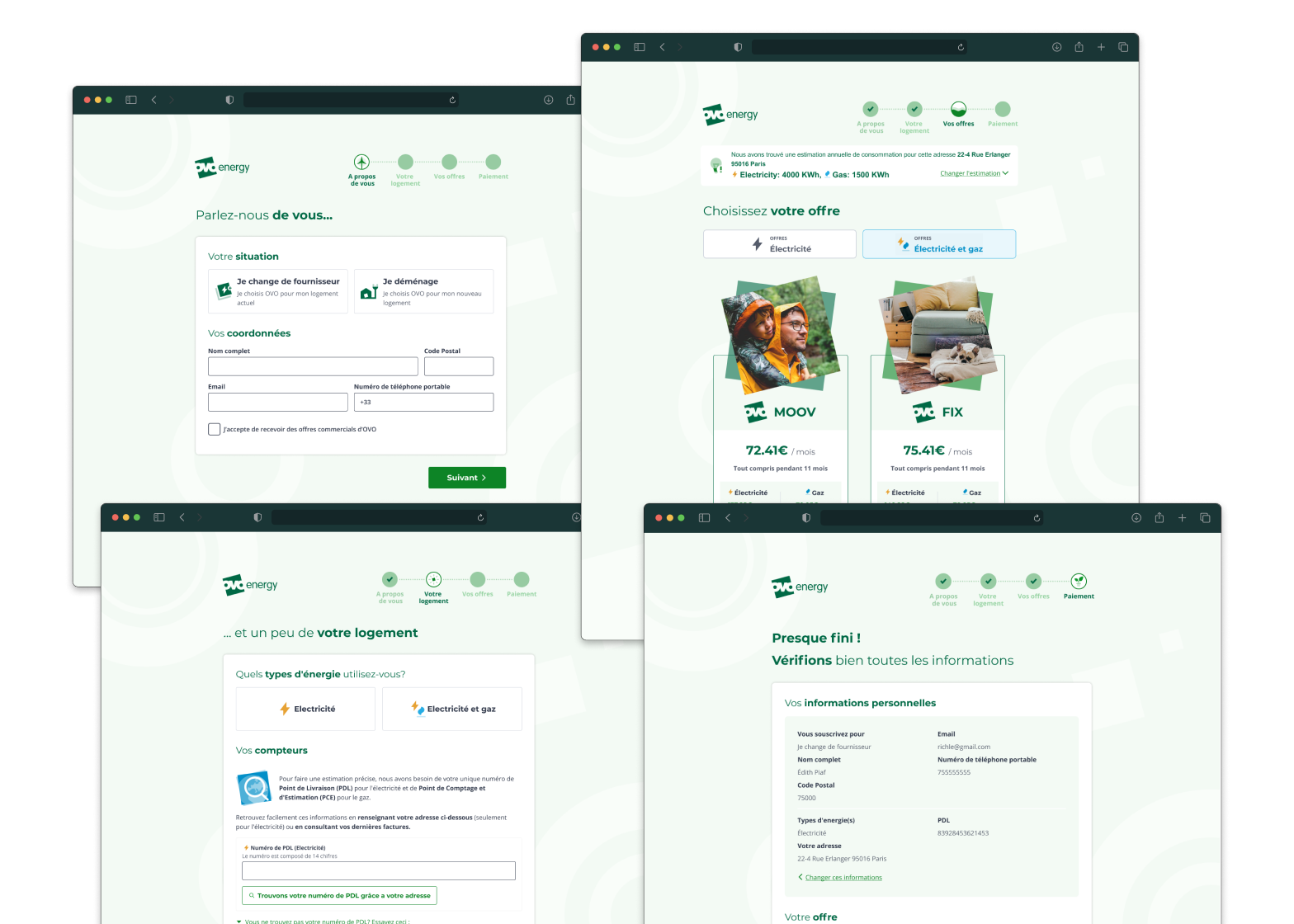
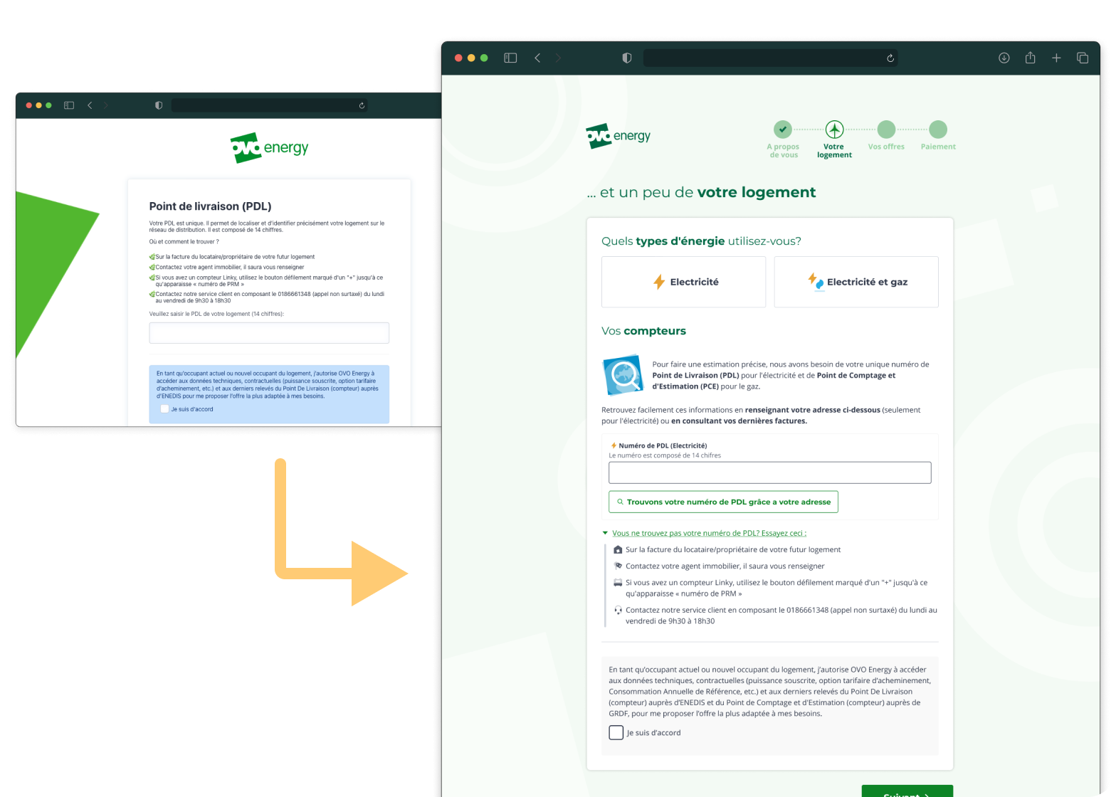
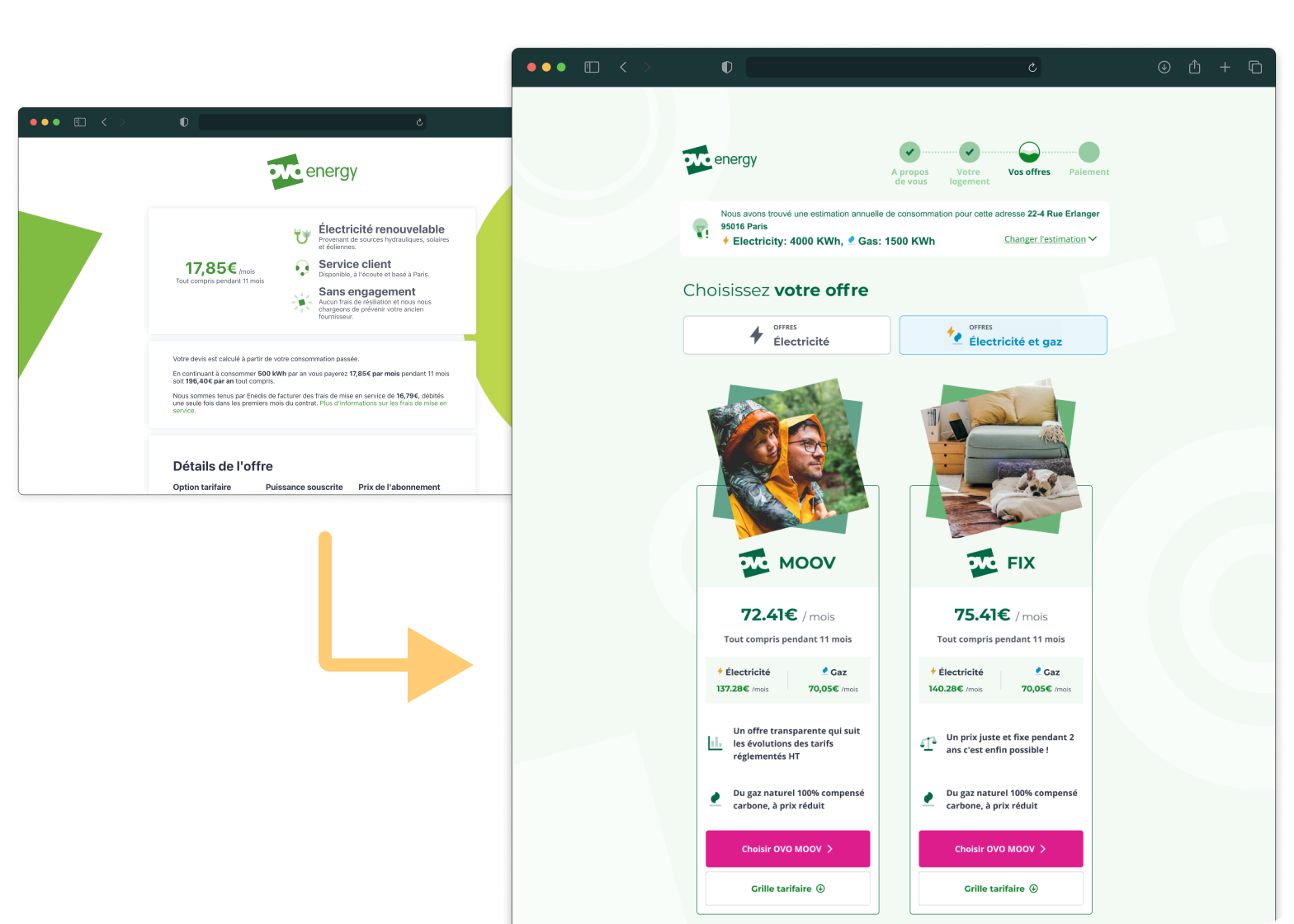
The acquisition journey evolved from a fairly simplistic multiple page flow into a more integrated and visually appealing journey, following a very agile methodology of incremental iterations. Every small change and addition was carefully planned based on competitor analysis, the constant review of the website’s analytics, reviews of Hotjar recordings, as well as unmoderated usability testing of prototypes, all of which I was responsible for and created. Some “before and after” comparisons are seen to the right. The focus on making changes based on data and creating that feedback loop of learn-iterate-validate was one of the main focuses of the design process I helped to establish and evangelise within the company.
Some example of changes to the Acquisition flow, were the condensation of its IA (which was comprised of more than 12 pages) into 4 steps, a useful new search widget for smart meter serial numbers, as well as the introduction of brand new retail products such as Gas and Fixed price. A lot of these designs are still in the process of development, split into incremental iterations which I helped prioritise based on research and conversations with the business.
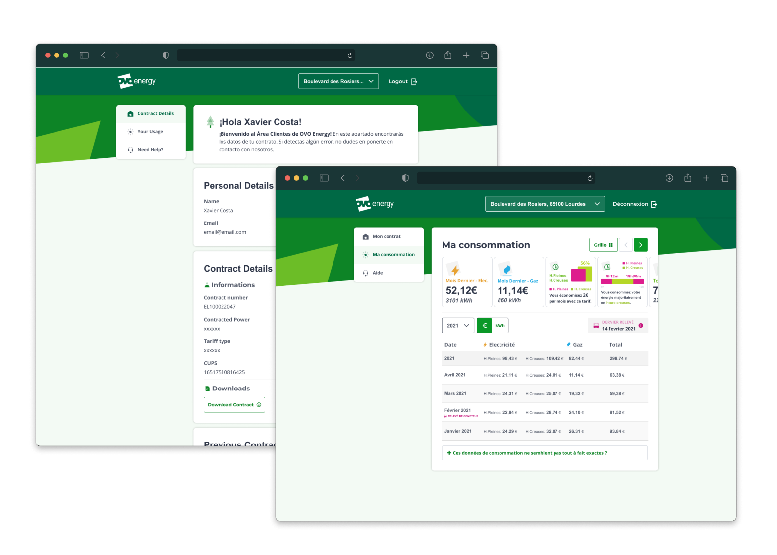
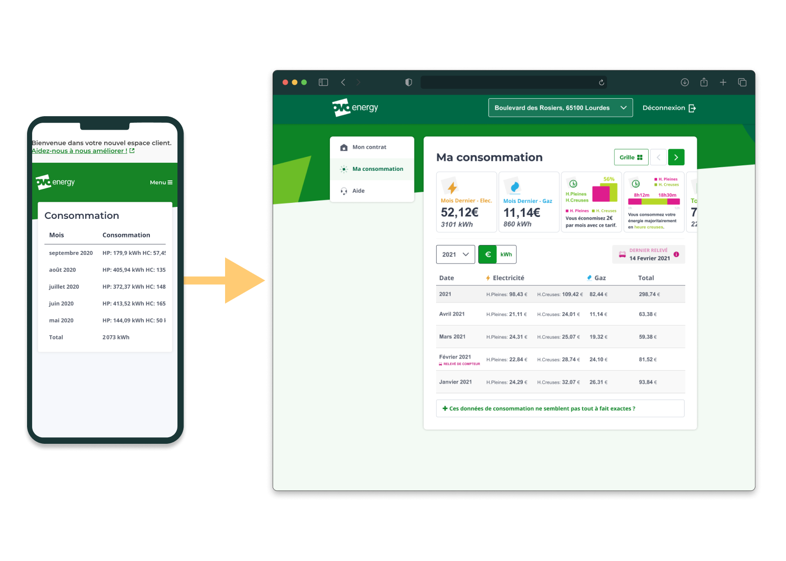
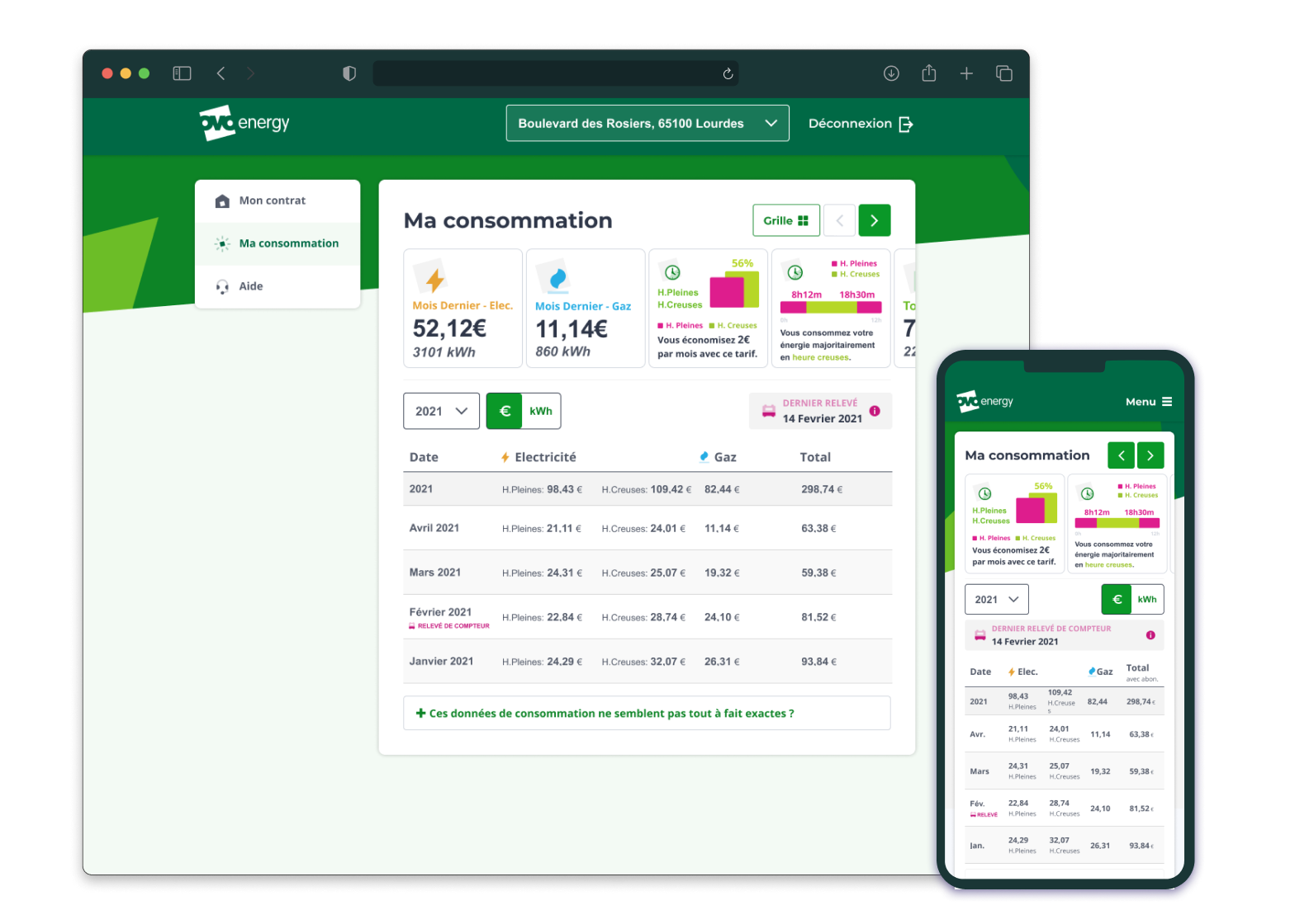
Similarly, the customer portal evolved iteratively, from a fairly barebones application (with basic tables and data points), to a more full-fledged portal that serves to inform as well act on the information provided. Working collaborately with a user researcher, we analysed feedback from customers, as well as conducted moderated interviews with french users, which helped establish a set of potential improvements and priorities for the evolution of the portal. In particular, we established that the usage page was one of the main weaknesses of our portal when compared to our competitors, and set out to improve it dramatically. This included making a much more readable data table, a system of quick insight widgets that call out the main points of information our users wanted to see, as well as a completely revamped IA and navigation based on the user’s mental models.
Details
- Designed in 2020-2021
- Duration: 1 year project
- Platforms: Responsive Web and Native iOS & Android)
- Tools: Figma